First off, a huge THANK YOU to everyone who has commented on the project thus far. I’m happy that you’re enjoying watching the game’s progress, and I hope that you’re looking forward to when it’s released, even though that’s still so far off.
Anyway, computer Role Playing games have changed a lot over the years, and to this day there still tends to be a rather large chasm between what defines “western” and “eastern” style RPGs. But despite all their differences—whether it be battle systems, character mechanics, or art styles—there’s always been one thing that virtually every RPG ever made has in common:
Text. Lots of text. Loads and loads of it.
For early RPGs, both on consoles and home computers, this was a bit of a problem. Today we can fit entire movies on our phones without a second thought, but just a few decades ago space was so limited that just finding the room for dialog was a major development hurdle in and of itself. The original Another Star emulated this by keeping character interactions short and to the point, often with intentionally stilted lines to recreate the feel of the era, even though the storyline as a whole contained an obscene amount of text compared to an actual 8-bit console game. Another Star’s text files combined together add up to over 400 kilobytes, which is larger than most NES carts. Even with some decent compression, there’s no way a game from that era would have as much text as Another Star.
Another Star 2 will likely have even more text than its predecessor. But I’d actually like to lean away from the original game’s dialog style and have the characters speak a little more naturally. However, I still want to keep the pace up, so don’t expect a visual novel. Persona this is not.
Like an actual 8-bit game, both Another Star and Another Star 2’s fonts require part of the character table. Here’s what Another Star 2’s font currently looks like, as seen in a debug overlay.
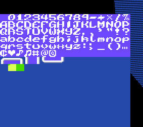
Notice that the font alone takes up almost half of the character table for the background, leaving fewer characters for actual map tiles. This was a very real problem that console games often ran in to. It’s part of the reason many games that only needed a little text would just make do with capital letters and not include any lower case ones. This is the solution that the original Another Star used to stick to its own 256 tile limit. 8-bit console RPGs of the era, which were usually made in Japan, couldn’t settle for this though, as they needed more than the English Latin alphabet’s mere 26 characters in order to manage a single set of kana.
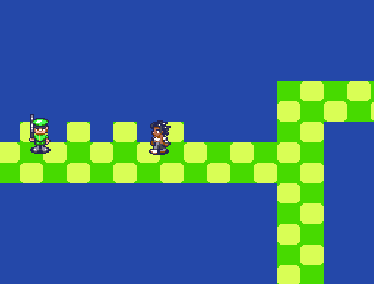
Because Another Star 2 is allowed to change between tile sets at will, I don’t forsee this being too big of a problem. As seen in the mockups I’ve done, the area maps are more detailed than the original game, but they aren’t meant to look quite as advanced as, say, the late SNES games that most “classic style” pixel art game prefer to emulate, such as Seiken Densetsu 3, Final Fantasy 6, or Terranigma. If it does become a problem, I suppose I can always steal a “cheat” from some of the later NES games: they had a special chip on the cartridge that would let the game switch between character sets between scanlines. Some lines would display the map graphics, while others could display the text and interface. Granted, this was possible because the NES has no VRAM and thus all the graphics memory was on the carts themselves, but I’m sure I could cook up some excuse if I absolutely have to. (Or just admit that I would be cheating and live with it.)
You’ll notice in all the mockups I’ve done that character graphics tend to be quite prominent, most notably in the form of character portraits for dialog instead of the speaker’s name. I want players to be attached to the characters of this game, and it’s hard to make that attachment in such a visual medium as video games when all you have to go on is a name on a screen and an itty-bitty mash of pixels. Originally I intended the portraits to be static, but I wanted the characters to be very expressive in-game. Here’s what they look like right now in-game.
Having a flapping mouth and blinking eyes was very rare for the time, but a handful of games did use them. Still, note that not only does the mouth flap, but the entire jaw moves. It’s really fairly detailed for a little 32×48 pixel graphic. The room needed to store all the portrait graphics, their layouts, and their animation data is a bit much on its own, not to mention the fact the graphics have to be streamed to VRAM each frame in addition to everything that’s still going on with the map graphics. Not impossible, perhaps, but it borders on the implausible.
However, when deciding on whether to go this route or not, I had to remind myself of the first rule of Another Star 2: “Another Star 2 is not actually an 8-bit game.” I believe having animated portraits makes the game more engaging, and as long as they’re not over-animated I don’t see them clashing with the art style, so I erred on the side of inauthenticity for the sake of making a good game.
Anyway, as a bonus, here’s what the portrait look like when viewed in the current iteration of the screen shader.
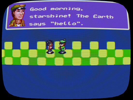
It’s meant to look like the console is coming in through a cheap RF adapter, but better settings will be available in the final game. I plan for a high-quality option that emulates a computer CRT instead of a television. There will also probably be a few different screen shapes to let you customize how much of the picture is chopped off by overscan, and how round the display is.
I personally don’t even like it when games have too much text. It wasn’t always like that. If you take a look at for example Wonder Boy In Monster World, there is only very little text and it still tells a whole story.
These days whenever I reach a town I’m already like “Oh no… lots of text to read again”. When I quit a game it’s always the moment I reach a new town. It’s a shame that developers need actual limitations to tell a story with few words.
Anyway more on topic: You should place that text about 5 pixels further “up” so the border below the text is as big as the border above the text. That would make it a lot more pleasant to the eyes.
Since the graphics are on a grid, I can really only move the text in 8 pixel increments. (Well, unless I cheat, which is always an option.) The additional space between lines is needed for diacritical marks in languages like Japanese or non-English Latin languages like German and French that use them. This is something you’d see quite a bit in games of the era. (For example, check out the NA version of Castlevania 2’s iconic “what a terrible night to have a curse” and notice how the letters are towards the bottom of the little box.)
Later text-heavy games that were brought over to North America from Japan would reprogram the game to eliminate the extra lines, so that all lines were used, since English really doesn’t use diacritical marks except for foreign names and a few loan words where they’re rarely used even then. The original Another Star went this route (although this made its all-caps font even harder to read), but would make it harder to do translations of the game without cheating the system somehow.
Another alternative is to just extend the box an extra empty line down so that the text is vertically centered properly, but then that makes the text box take up even more of the screen.
Right now I’m not too worried about it, but you can bet I’ll lose sleep over little things like this further down the road to completion.