I’ve been hard at work trying to get Another Star ready for release. Part of that entails making sure the game looks its absolute best.
![]()
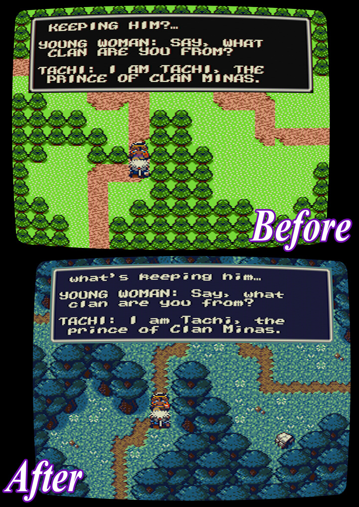
Tachi looks more like his promotional art now.
As discussed in my last post, I’ve been toying with the idea of abolishing the self-imposed 256 tile limit. I haven’t decided for sure one way or the other, but I have been making new sprites to test out the waters.
It’s quite a difference!
What does everyone else think? Is the improvement enough to follow up on?
Tachi’s sprite – clear improvement.
Forest picture – um that doesn’t just look like a graphical improvement but rather that you changed the whole game from “intentional nostalgia” to “let’s make it as good as I can”. Which one is better strongly depends on who are you aiming the game at.
I kind of liked the game’s nostalgia feeling even including all upper-case letters. On the other hand I wouldn’t mind those “improved graphics” either.
If you had to pick just one, would it be the 256 tile version?
That’s a tough question! If I hadn’t played the game before I wouldn’t even know what to take. In Half-Minute Hero I would always prefer the retro style, but that’s also because I don’t like the HD style at all in that game.
As I’ve already played Another Star in retro look however, it’s more likely I’d play with the improved style.