Early RPGs, whether released on consoles or the personal computers of the day, had very simple interfaces. This was common across all genres, of course. RAM was severely limited, especially on consoles, so there was only so much room to store data and graphics. But this was harder on some genres, like RPGs and strategy games, than it was on others. Sometimes important information had to be remembered because there just wasn’t enough room to keep it on screen. Other times, the games left out important information altogether and you had to keep the manual and a bunch of fold-out charts on hand if you wanted any chance at making sense of it all.
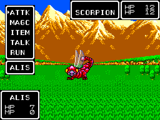
These early RPGs are perhaps most famous for their simple text menu, usually consisting of the classic Fight/Spell/Run/Item combo. The original Another Star followed this tradition practically to the letter.
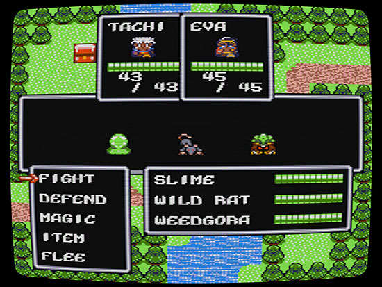
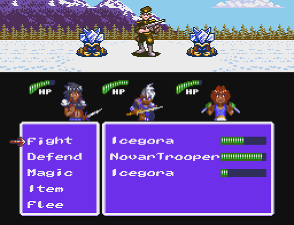
This screenshot is from the game’s original release. Notice how much focus is put on the interface elements themselves. The party is squished in up at the top, enemies are barely a blip on the screen, and most of the screen space is dedicated to menus and numbers. A little over a year after the game first came out, I did a new version for the game’s release on Steam. This new version included brand new graphics for all the enemies.
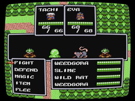
The enemies are bigger and more distinct here, it’s true, but many of the same issues remain. Now, it’s not necessarily a bad setup. You can only make text so small on an 8-bit system without getting into serious VRAM issues, and this interface packs in a lot of information that most RPGs didn’t even bother with, like details about the enemies’ current HP and health bars for the player’s party members to help them better visualize how their party is holding up.
But for Another Star 2, as you’ve seen from past mockups, I really want more focus put on the graphics themselves. I want the enemies to be big and detailed. I want the backgrounds to really give a sense of the game’s setting. I want the party members to be recognizable and relatable—I want them to face the player when they’re receiving their orders instead of always standing with their backs to the camera, so that the player knows what they look like and can actually get attached to them. This is really asking a lot of an “8-bit game”, but it’s not entirely without precedent.
Phantasy Star was a late Sega Master System game. Notice how bright and colorful the background is, and how it takes up the full screen. The enemies were even animated when they attacked, although they could only ever manage to fit a single enemy on the screen at a time. This game really pushed what the console was capable of.
However, by giving more priority to the graphics, I’m left with less room to assign to the interface. I used mockups to try and solve this problem by seeing what I could move around or reorganize. I wrote about the process in more detail here before I even began actual work on the game, but to summarize, I began by simply recreating the interface to the first game.
This would work, in theory, but it’s awfully cramped. The bottom 8 pixels of the characters would be covered by the menu whenever it comes up, though that’s not too big a loss. But on a real television, the trooper’s head would be hidden under the overscan, and there’s meant to be even bigger enemies still. The interface had to be made smaller. After several iterations, I came up with this mockup:
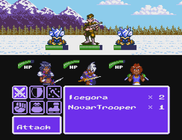
By shrinking the window-based interface elements down sixteen pixels and moving the HP bars up to the enemies themselves, not only does everything feel less cramped but parts of the interface now feel a little more connected to what they’re meant to represent. Still, there was the problem of the menu itself. Another Star had five battle commands, not four. One of them had to be pushed off the end, indicated by the down arrow letting the playing know there’s more they can do. But that seemed sub-optimal. That arrow is pretty small. Would the player always realize at a glance that there were more options? Forgetting “flee” might not be a big deal 99% of the time, but Another Star 2 is set to have at least one new battle command, so what else might get lost in the shuffle? It seemed there must be a better way.
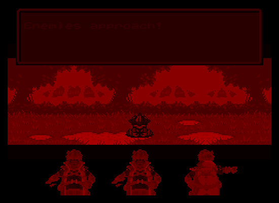
I put this all on the back burner for a long time, but now I’m working on getting the battle system up and running, so it finally came time to confront the issue head-on. My first attempt, pictured here in-game:
The cursor hadn’t been implemented yet, but it was going to point to the selected option, making it more obvious that it was an option. And since you could only see one of the options at a time, the layered windows should have communicated pretty well that there was more you could do. But it seemed so clunky, especially since I really need to keep the 8 pixel tile above each letter of text reserved for languages that need diacritics (you’ll see this often in Japanese RPGs on the NES; it’s how they implemented the dakuten for their kana characters). I thought about adding a little animated icon for the current selection to liven it up a little, but I was already out of VRAM tiles for the scene.
Then came the engine reboot I talked about in the last dev log entry, at which point the tile limit became more of a suggestion than a hard-and-fast rule enforced by limitations of the engine itself. So I decided to do a mock up of what it might look like if I went all-in with icons.
I hated it almost immediately. It didn’t feel very 8-bitish to me at all. On the NES and Master System, text was used for everything it possibly could be. The letters were already taking up precious space in VRAM. Why waste them? Extensive iconography was rare even into the 16-bit console era and beyond. Mainstream Final Fantasy wouldn’t even get a visible HP bar until the PlayStation 2 came around!
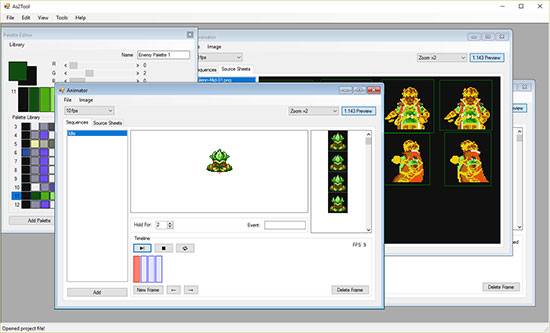
But the mock-up got a pretty good response when I previewed it on Twitter, and after sleeping on it, it did kind of grow on me. I decided to try implementing it in the game just to see how it’d look for real. The custom As2Tool application I wrote to help make the game has an animation tool that standardizes all animated graphics in the game, cutting down on the amount of graphics-related stuff I have to hard code in the engine. The tool is very simple and somewhat primitive, but it ended up being fairly flexible and allows a single frame of animation to have multiple elements, so… well, suddenly it was very easy and fast to make things look however I wanted them to. Maybe I got a little carried away, even?
Apologies for the poor quality of the GIF, but this is actual footage from the game. Granted the characters are stuck on arbitrary loops right now for testing, but look at how alive the whole thing feels! Another Star 2 is supposed to carry on the torch of Another Star’s fast-paced battle system. It’s supposed to feel snappy and energetic! Look at how the screen flicks down to focus on the party when it’s time to give orders. Look at how the clash of swords sends sparks flying. It’s meant to keep you pumped and eager for battle! It actually turned out better than I’d imagined it.
It doesn’t look like an NES or Master System game interface at all, but having tasted from this particular chalice, I’m not sure I can go back to the old ways…
In the next dev blog I plan to dig a little deeper into the inner workings of the battle system itself. There’s a lot I’m not ready to reveal yet because it’s so early and so much can change between now and release, but there’s some interesting changes planned in comparison to how things worked in the first game.