In my mind, I always tend to group Another Star with two other titles: Freedom Planet and Shovel Knight. All three came out around the same time, and all three take heavy inspiration from a past system; Freedom Planet from the Genesis/MegaDrive, Shovel Knight from the NES, and Another Star from the Master System. Freedom Planet and Shovel Knight are far more polished—and exceedingly more popular—than Another Star, so the comparison may seem a bit silly, but I just can’t help but consider them “sibling” games.
This past Christmas day, GalaxyTrail made a surprise announcement with a rather amazing trailer for Freedom Planet 2. For whatever reason, the exhilaration of the trailer mixed with seeing Another Star‘s sibling series make such a splash again made me feel more than a little nostalgic, and I couldn’t help but think about Another Star.
I’ve noted many times before when asked that there’s really no plans for a sequel to Another Star, and that much is still true for the most part. I’d like to come back to the game eventually and give it a spiritual successor to build on the battle system, if not necessarily a direct sequel. But I didn’t really want my next game to just be more of the same thing, and I didn’t want to get pigeon-holed as a retro-pixel-art RPG developer and nothing more. Yet in the nearly two years now following Another Star‘s 2014 release, I still don’t have much progress on a second game other than the few prototypes I’ve posted here.
Thinking about what little plans I’ve had floating around in my head for a direct follow-up to Another Star, my internal creativity insisted on expressing itself somehow and so I wasted my time cobbling together a mock-up of what I imagined the battle system of a theoretical Another Star 2 might look like. This is the result of that initial spark of imagination, which I originally posted on Twitter on the 27th of last month:
Again, keep in mind that this and everything else in this post are merely mockups and conjecture. No game and no gameplay exist. Right now they’re just concepts and ideas and nothing more, and they may well never be anything more than that.
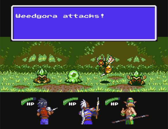
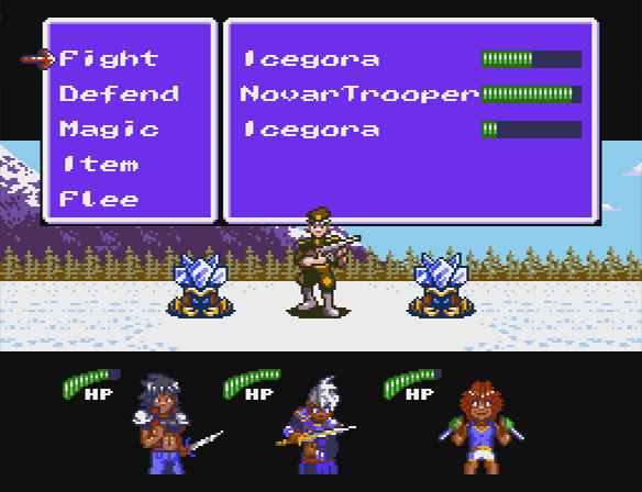
Still, right off the bat it’s apparent that this looks a little more advanced than a Master System title. It’s quite a bit closer to the TurboGrafx-16 (aka the PC Engine), honestly. Ignoring the palette, which is based directly off the 8-bit master palette used to derive Another Star‘s mere 16 colors, the enemies are sprites instead of background tiles like most NES games have for RPGs. (The three player party members depicted against the black background would be tiles instead.)
The NES and Master System were both limited to, at most, eight sprites per scanline, and each sprite was exactly eight pixels wide. This is why so many 8-bit games have a huge problem with their sprites flickering. They’d end up on the same horizontal line of pixels and some of them would get ignored. However, the battle screen above has four enemies, and each enemy would be constructed of multiple 8×8 sprites. At their size (about 32 pixels wide), each enemy would need four sprites worth of width. Since the enemies are arranged horizontally, four enemies times four sprites wide means that you end up with sixteen sprites on a scanline. That’s twice the allowance for most 8-bit systems. It does adhere to the imaginary specifications of the imaginary 8-bit Vision Game System which supposedly ran the original Another Star, but I worry it could be a turn-off to those who were drawn to the original game because of the strong graphical resemblance to the NES Dragon Quest games.
Regardless, I ended up really liking how that mock-up turned out, especially the forest background which really exceeded what I thought I could accomplish. So I decided I’d do just one more concept mock-up.
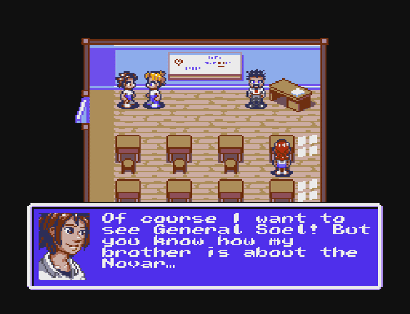
This time I did an area map, to see how the characters might look moving about the world. Notice that they’re taller than the normal 16×16 pixel sprites of most NES overhead games. However, a couple of the later NES RPGs did use them (Crystalis and Lagrange Point, et al.), as well as the Master System’s own magnum opus Phantasy Star. On an 8-bit system, you’re using up more VRAM because larger sprites obviously take up more space, but since they’re not any wider they wouldn’t cause any extra flicker. And those extra pixels are surprisingly useful for making the characters really pop out and feel unique.
If you look closely, you’ll notice that the way the heads of the two students talking are done in the mock-up closely match the way I drew Tachi’s head in Another Star. I referenced the original game’s graphics quite a bit while doing these.
For some reason, I decided to do just one more area map.
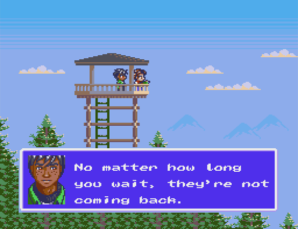
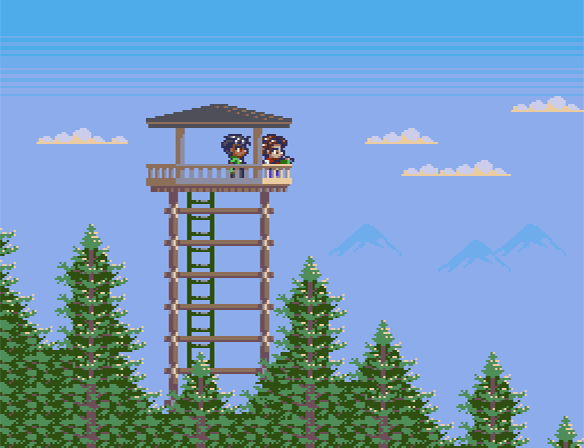
When I was nearing the end of production on Another Star, I decided that whatever the sequel or eventual spiritual follow-up to it may be, it would begin with a character in a forest, keeping watch in a look-out post. I didn’t decide why, or even what exactly they were watching for, I just knew that this was the scene I wanted to use to introduce the new hero or heroine of the game. This is a mock-up of that scene, which I decided would be more interesting in a platformer-style perspective than trying to top-down sprite an outpost tower, although I never did decide what they’re watching for, despite the character’s statement here that whoever it is, “they’re not coming back.”
(You may also notice that in this screen and most of the others there’s an extra line of spacing between the sentences, unlike the classroom. It’s something a lot of Japanese RPGs did on 8-bit systems, and I almost did this for Another Star. The extra line of tiles is for diacritical marks, which are unused in normal English but needed in Japanese and many European languages. When localized to English, some games removed those lines so they could fit more text on the screen.)
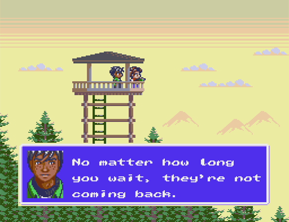
However, shortly after finishing and posting this mock-up, I realized that it would make more sense for this scene to happen at or near sunrise, because the light-skinned character still has to go home and get ready for the class she attends in the first area screen I did. So I tweaked the palette a bit.
If you’re wondering what the green thing is that the light-skinned character is holding, it’s supposed to be binoculars, which would be more apparent in an actual game where the sprite could change so that she actual holds them up to her eyes from time to time.
Finally, here’s what it looks like without the dialog box cutting off a chunk of the screen:
Anyway, while working on the two area maps I just went over, I started to think about the overworld map. When your sprites are 16×16 squares, they’re already sort of “symbolic” and don’t look that out-of-place when you zoom out to the world map with even more wacky scaling issues. But the taller sprites can look a bit jarring on an overworld map because they tend to appear more in-scale to the normal area maps.
Final Fantasy VI got around this by dazzling us with its fancy SNES mode 7 graphics, but I decided to play around with the Chrono Trigger route of actually making different, smaller character sprites for the overworld.
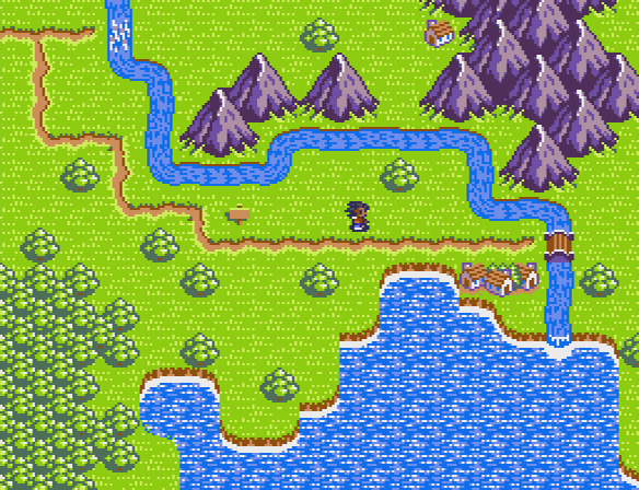
I do like how it came out, even though it has some issues with how it tries to skirt 8-bit limitations. First off, as nice as the mountains look at that size, there’s a reason NES games tend to make a single mountain tile and just stamp it all over the place. The VRAM those mountains would eat up would be costly, and would mean less graphics for other things.
I really wanted actual sandy beaches for the coastline, but I couldn’t get it to look right while still being at least conceivably able to fit within the VRAM limitations of an 8-bit system. Still, the roundness of the coast is actually a pretty nice throw-back to the original Another Star. Really love how the bridge and little village turned out, too. The forest looks pretty good as well, although it’s a bit over-rendered in my opinion.
The river I have mixed feelings about, but I do like how there’s a shallow ford crossing near the top of the screen. That was a map feature that I originally had in Another Star that got cut fairly early on because of the tile limit. It was supposed to be used in areas that didn’t really have enough traffic to justify having a bridge built there.
After finishing this, I had three of the four main screens of a classic console-style RPG: a battle screen, an area map screen, and a world map screen. I just needed one more to complete the set: a menu screen.
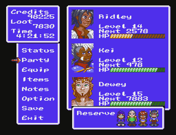
Here we finally find out the character’s names, even though they’re liable to change supposing I actually made this into a full-fledged game.
The layout is obviously taken directly from the original Another Star, but there’s a few things changed up. At the bottom is a “reserve” of extra party members. Another Star stuck you with three characters and set you off, but I want the player to have more power to customize their set up in any sort sequel. Combining multiple party possibilities with Another Star‘s omni-attack mechanics is an idea I’ve wanted to see realized for a long time.
I figured I’d stick the extra characters on the main screen instead of hide them, so that they don’t feel left out when they’re not in the party. And maybe the characters in the “reserve” could have some other sort of contribution somehow when they’re not in the main party?
It was at this point that I had planned to finally stopped, but there was one more thing I kind of wanted to work out, and that was how the player input their battle commands.
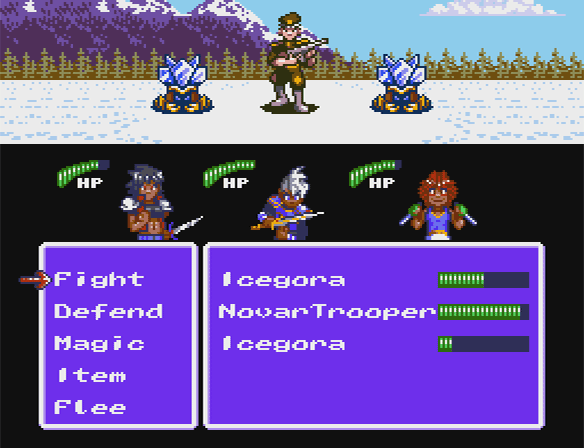
The idea I had was that, at the end of each phase of battle, the screen would quickly scroll down to give the player their battle menu. The characters would also turn around to face the player, because I really like it when I can see who I’m playing as.
I forgot how much room Another Star‘s battle screen took up until I did this. You’ll notice the enemies are nearly pushed off the top of the screen. You’d lose even more to the overscan of a traditional television (or Another Star‘s CRT filter), and it’d even be more noticeable for big enemies like bosses.
Well, okay then, what if the screen didn’t scroll, and the menu was at the top?
Yeah, that’s probably not going to work. Even if I set the menu tiles with a higher priority to appear above the sprites, that trooper’s head is going to be clipped and it would look just as tacky as being above it. We want to be able to see who we’re fighting, after all. What’s the point of having big, fancy enemy graphics if you can’t see them?
Well, since the game can probably only have four enemies at a time anyway if we stick with the pretend Vision Game System’s specs, maybe we could just have four lines and push the “flee” command off the bottom of the menu to make the box smaller?
It’s not ideal, but at least the trooper isn’t being squashed. Hopefully players would realize there’s more options, though. Ideally, the down arrow tile would be animated to go up and down a pixel so that it’d stand out more.
The trooper would probably not be the biggest enemy, though. What if we were fighting, say, some huge dragon? We’d be back at square one. Let’s try scrolling down again.
Okay, that’s not too bad. Especially tall or big enemies would still be lost to the overscan, perhaps, but it seems to give a lot of breathing room. I’d also really like to be able to display the player’s character’s names, but there’s hardly any room left as is.
I like this option the best, personally, but maybe you feel differently?
In any case, this is where I should have stopped, but I decided to make just one more in preparation to make this big, long blog post.
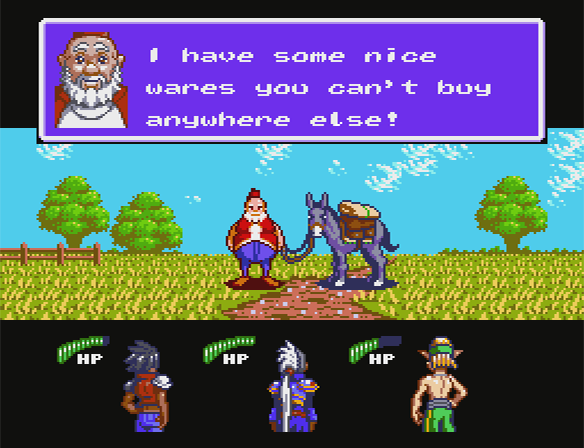
In Another Star I had a lot of self-imposed limitations when it came to the graphics, but not so much with text. Early on, one of my thoughts was that maybe not all encounters would be battles. Every now and then, when you accepted an encounter maybe you’d get some text describing how you’d just come across a wandering merchant instead. Or you’d chance across some other adventurers with news and the beginning of a side quest. Maybe it’d be a short scene describing how you came across extra loot, items, or some free EXP.
The idea was scrapped before I ever attempted to implement it, but it seems the idea has stuck with me. This concept mock-up illustrates the party chancing across a random merchant. The screen is the same as a battle, except that the party isn’t drawing their weapons. In another scenario, this setup could easily transition into a battle, though. Say you choose to help somebody, and they turn out to be bandits? It was just an interesting thought, and I wanted to see how it might actually look in-game.
In an actual game, I’m not sure how annoying these non-battle encounters could be while trying to grind, though. Then again, getting free items and EXP every now and then without having to fight could always make up for the occasional ones you have to stop and make a choice for, perhaps.
Well, that’s finally the last of the concepts I did. What are your thoughts? Is this something you’d be interested in seeing? Do you feel it strays too far from what Another Star was? How important are the 8-bit limitations of the original game to you?
Let me know in the comments!
Actually, I was getting kind of excited when I saw these screenshots because I thought maybe a sequel was in the works. While I’m still wishing that Junction would be completed one day, or even something else that’s different than Another Star, I would have totally understood if you had gone with a sequel instead.
I think the original limitations made you more creative, at least initially, as you tried to get around those limitations. For that reason I think limitations are a great thing because people are forced to work with what they have and still make it interesting, etc. However, I think after a while, you made some decisions that bettered the product overall even if it didn’t fit the original plans. I think there would be nothing wrong with Another Star 2 being more of a spiritual successor than a literal, here’s what the last game looked like, successor.
Aaah! Haven’t checked your blog in a while, but this… this looks amazing! It’d be instant buy from me just by looking at the screenshots.
Now regarding limitations… well what I do think is that if you strictly adhere to the 8-bit limitations, then you will keep having problems selling your games. I think both 8-bit and 32-bit didn’t age so well, so if you want to be successful with retro games 16-bit is probably your best bet.
8-bit limitations might be great from an “art” look of the game, but not every player is an artist or even understands the art.
What I do think however is that limitations help making better games. But those limitations don’t have to be the same as they used to be 25 years ago. These days you can freely put your own limitations, which actually does allow for a better game in the end. It just needs to fit together.
That being said, I think if you made a game and put exactly those screenshots above as sample screenshots, the game will sell at least 3 times better than Another Star. For me that really hits the Phantasy Star and Chrono Trigger itch I’ve been having. And it also kind of wants me to play a grid based dungeoncrawler again for some reason, even though that’s not included in the screenshots lol (well technically the last one, plus the fact the interface reminds me of Shining in the Darkness).
It’s actually strange, for some reason your style really makes me want you to make games like my favorite games ever (that is Phantasy Star, Chrono Trigger, Shining Force and Shining in the Darkness). Like, I look at the screenshots and feel like “Dude you have to spam this guy with e-mails until he makes games that are like those games you liked” (remember when I sent you an e-mail to make an SRPG, that was me wanting you to make a Shining Force 4 basically).